But then I happened to buy a huge stack of Ditko's Charlton ghost stories mainly from the 1970s and early 80s. This was, I discovered, nice work. Especially the covers. And, of course, I decided to give such work consideration and began to collect it.
One title of which I was aware was SPEEDBALL. This is one he created upon his belated return to working at Marvel Comics. It's a hard one to pin down, and not among my favorite works by Mr. Ditko. He created, plotted, and penciled all of the ten issues he produced before it was canceled. But it's not the kind of thing that was foremost in my mind to add to the boxes of my Ditko books.
Finally, though, I located an entire set in nearly new condition at a silly-low price and took them home. The covers are pretty good for this period for Ditko, but the interiors just don't do it for me. There's not a lot of inventive use of layouts there, and none of the inkers seem to have appreciated delineating his pencils. I do understand that Ditko was all about laying down the line in quick order as he went into his later years--giving what he felt was a fair day's work for a fair day's pay. Perhaps that's why there's almost no magic to this series.
When I compare it to something like STATIC, which he did not too many years before SPEEDBALL, there is an enormous difference in quality. Maybe he just wasn't going to bust a gut for Marvel. It's hard to say.
The dialog is by Roger Stern, and I see little of Ditko's political and philosophical dogma running through the stories, but that stuff is there if you pay attention. In addition, there seems to be a struggle afoot between the creator and the publisher:
SPEEDBALL was marketed (it seems to me) as a book for younger readers. There is a grade-school feel to the logic and storytelling there. But it also has a hard edge to it in some of the adventures--and knowing Ditko's black/white good/evil way of seeing the world, I wonder if the series was indeed intended by him to be aimed at younger readers, or if the book was blind-sided by the publisher and its editors.
Who knows?
At any rate, I added them to my collection. It ain't THE AMAZING SPIDER-MAN, and it's not STATIC, and it's not even THE CREEPER or THE BLUE BEETLE. But it's still Ditko.
 |
| SPEEDBALL #1. Ditko starts off the series with a butt shot of the new hero. From everything I've read, his old professional nemesis Stan Lee HATED such covers. Seems fitting Ditko would deliver exactly thus since Liar Lee wasn't in the position to nix the cover at this point. |
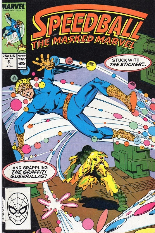 |
| Issue #2. One of the weirder villains. |
 |
| #3. Ditko seemed to enjoy creating superheroes who are not supremely powerful. Speedball is just such a creation. Unique, but not god-like. And so the villains he faced were similar in stature. |
 |
| SPEEDBALL #4. |
 |
| SPEEDBALL #5. I didn't particularly care for the inking done on any of the ten issues. It's all just uninspired. Decent, but there's no magic or care in it. I suspect Ditko must have been delivering the least amount of detail in his pencils and layouts. |
No comments:
Post a Comment